Thryve
Helping a wearable tech data analysis company step-up to the challenge
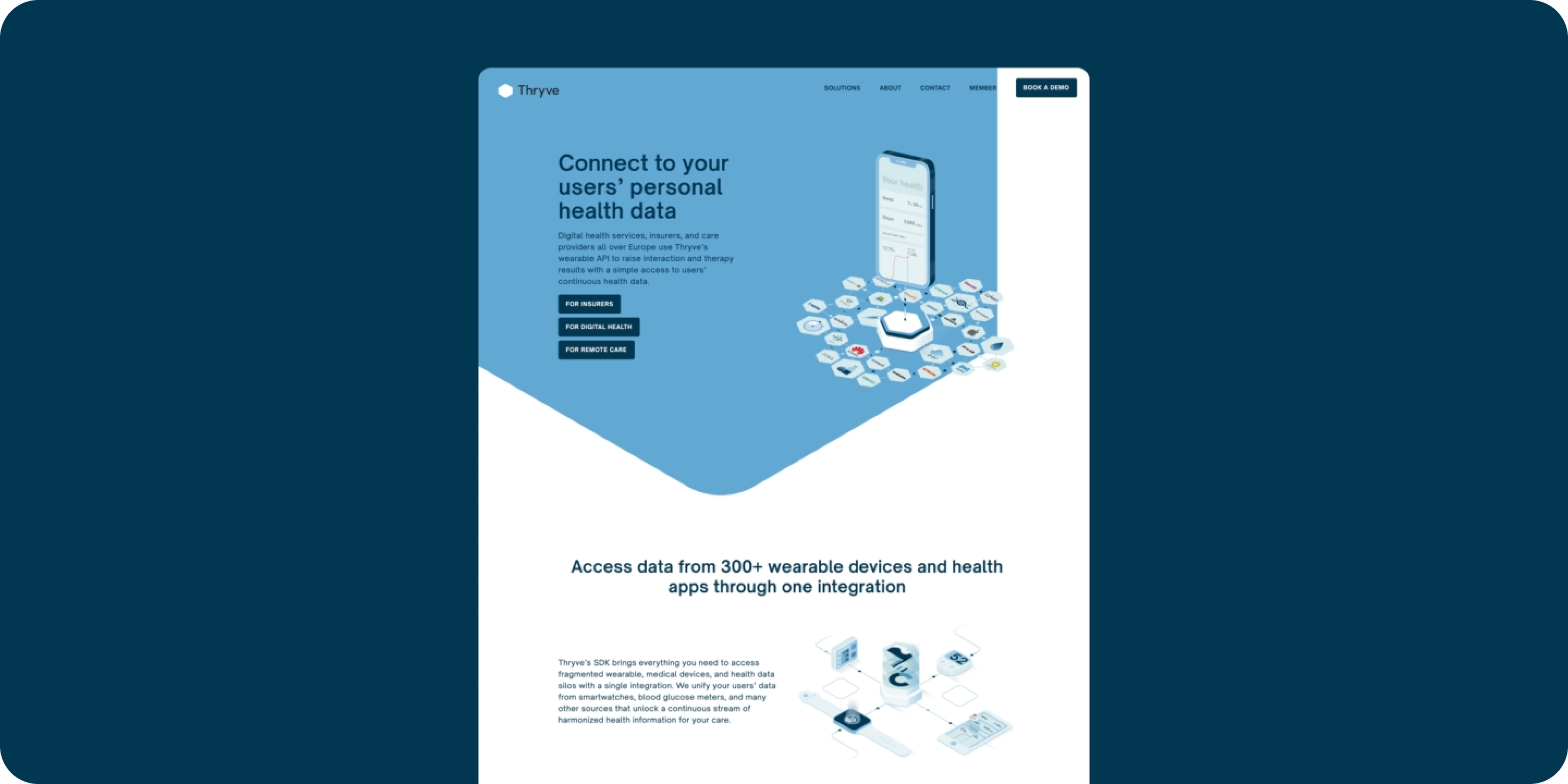
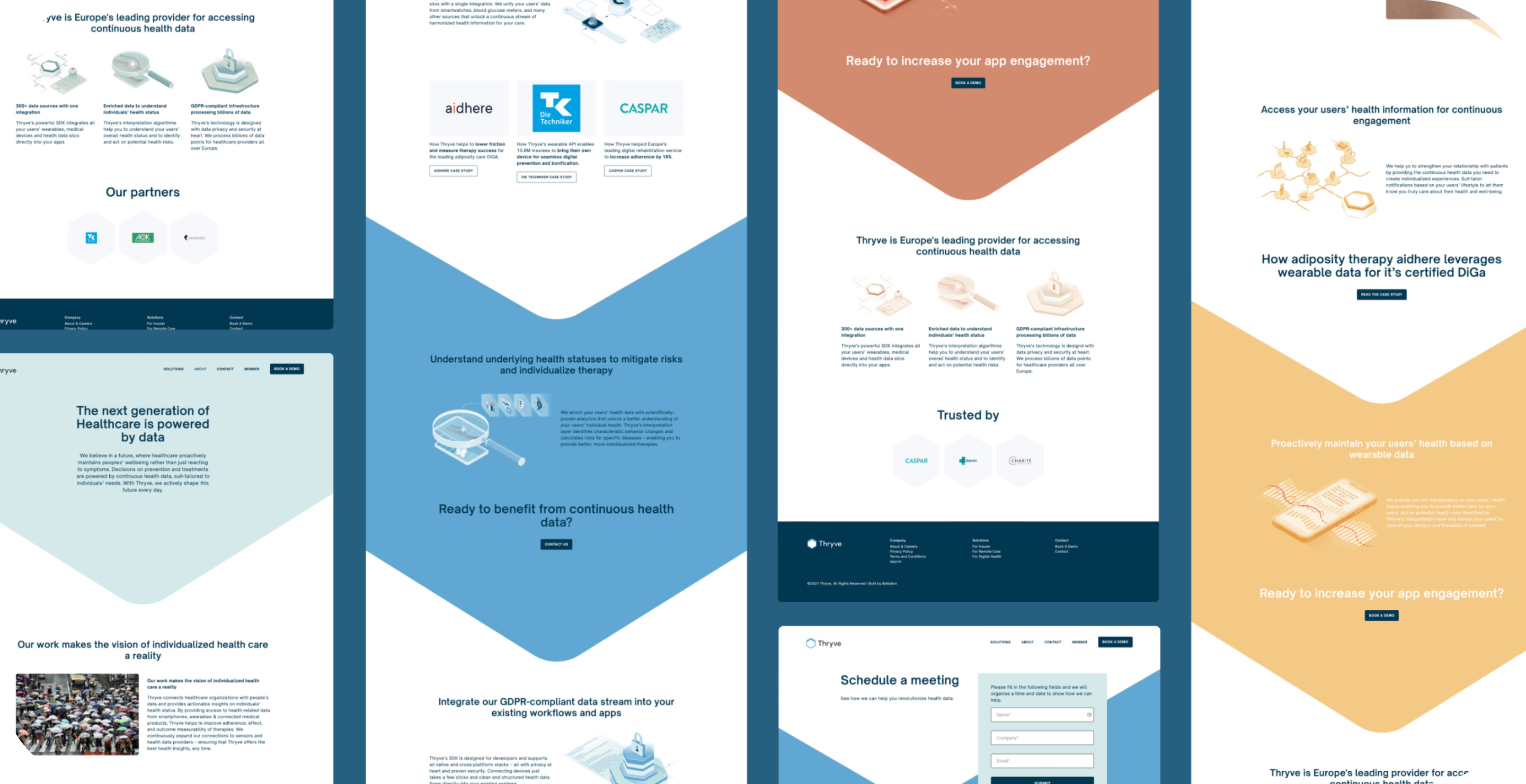
Our designs were based around the interconnectedness of the brand hexagon icon.
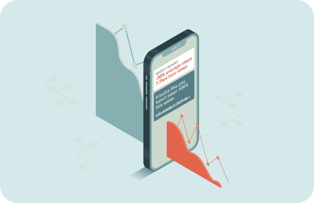
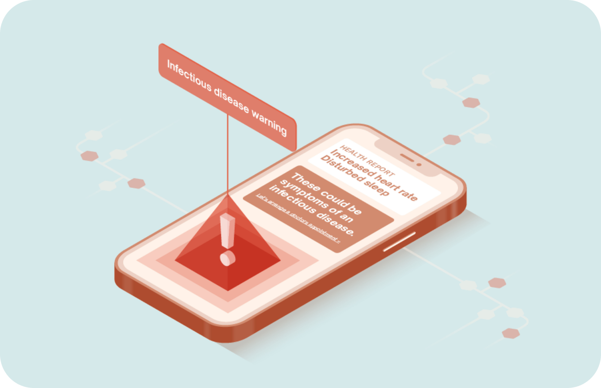
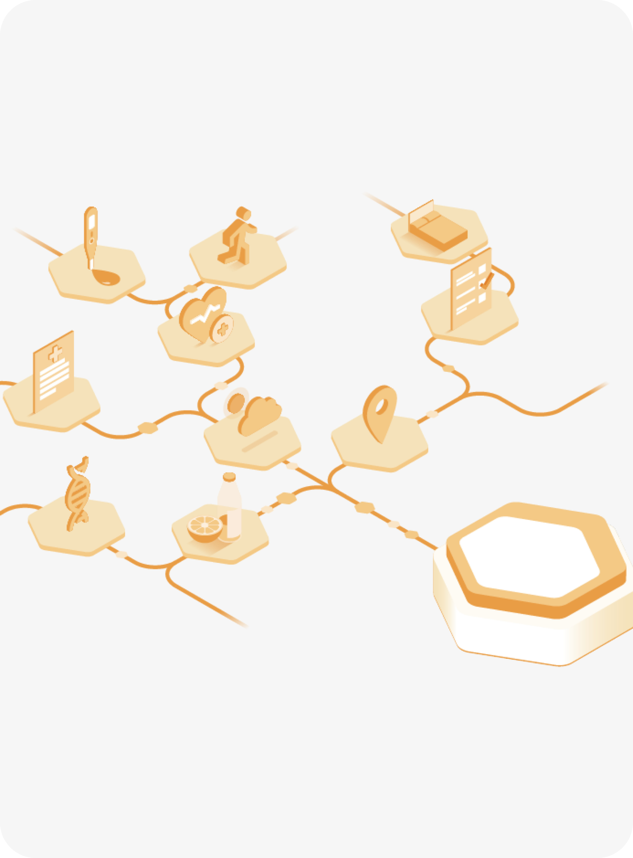
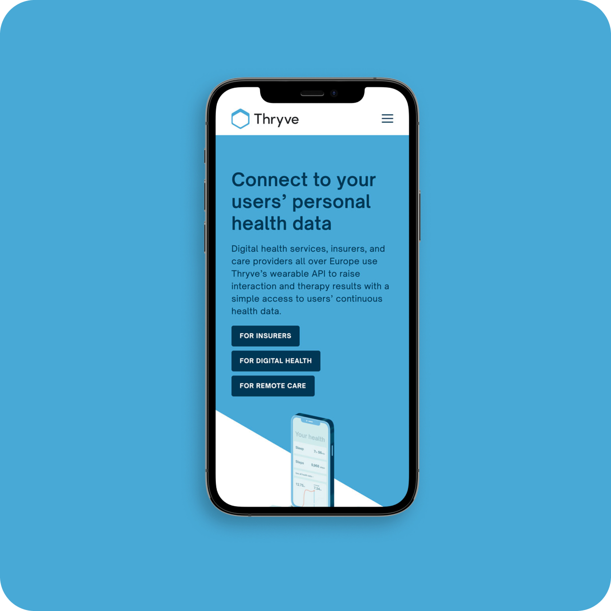
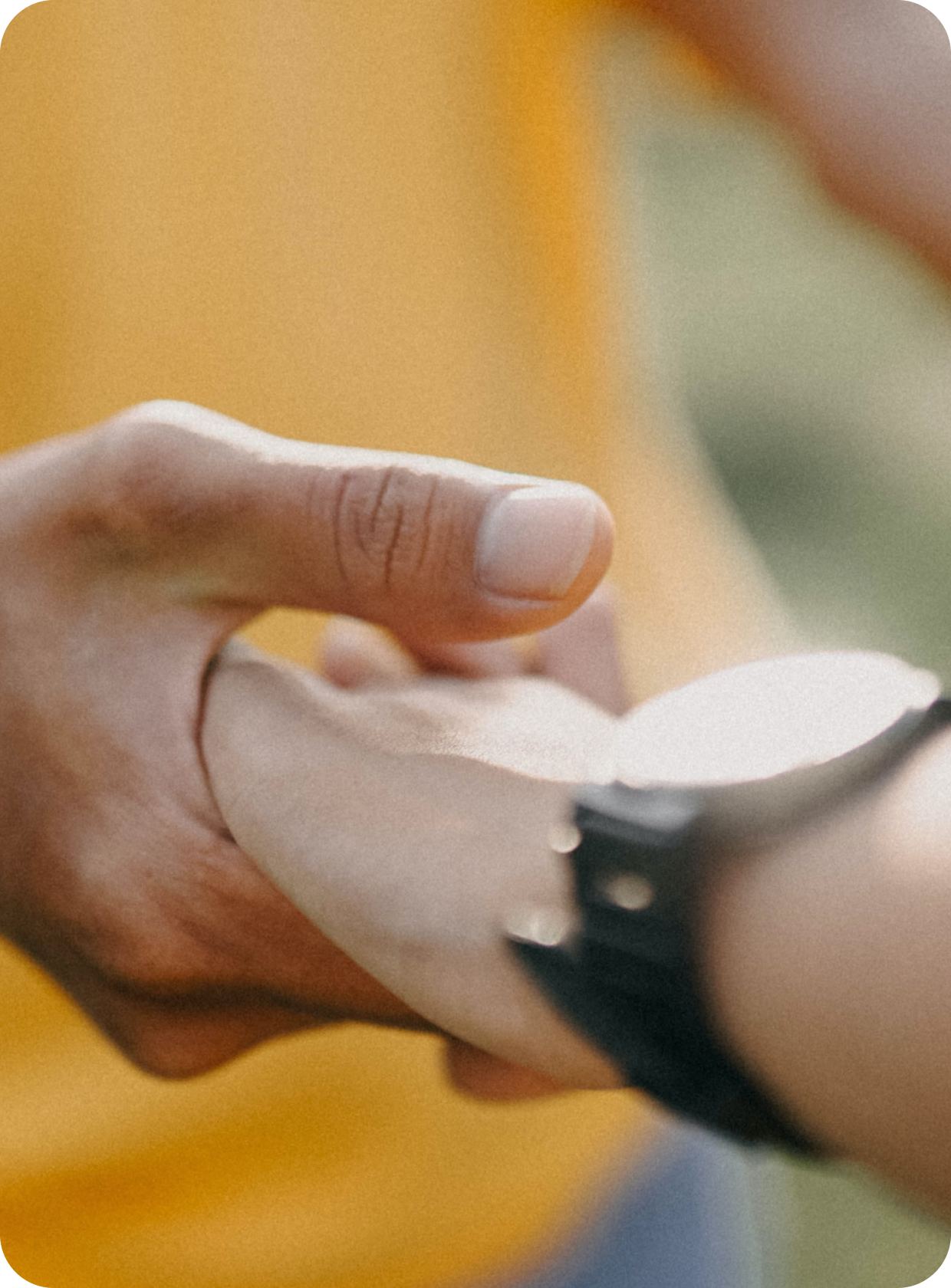
It was also key to appeal to Thryve’s target audience, so we utilised both tech and healthcare aesthetics. Cool blues are combined with soft colours, layouts are clean and simple with bespoke illustrations demonstrating how the technology works.
Combined, these elements focus on making the technology easy to understand and communicate that Thryve is a tech-driven medical company that cares.