Starwest Botanicals
A revitalised experience for a natural products e-commerce site
Challenge
For almost 50 years, Starwest Botanicals has been a trusted supplier of herbs, spices, teas and botanical ingredients to consumers, businesses and manufacturers across North America.
As the business continued to grow, so did the complexity of its digital experience.
With an extensive product catalogue, multiple customer types and a wide range of purchasing journeys, the challenge wasn’t attracting customers—it was helping them find the right products, navigate the experience with confidence and move through the buying journey more efficiently.
The existing experience needed to better support product discovery, simplify decision-making and create a clearer path to purchase for both retail and wholesale customers.

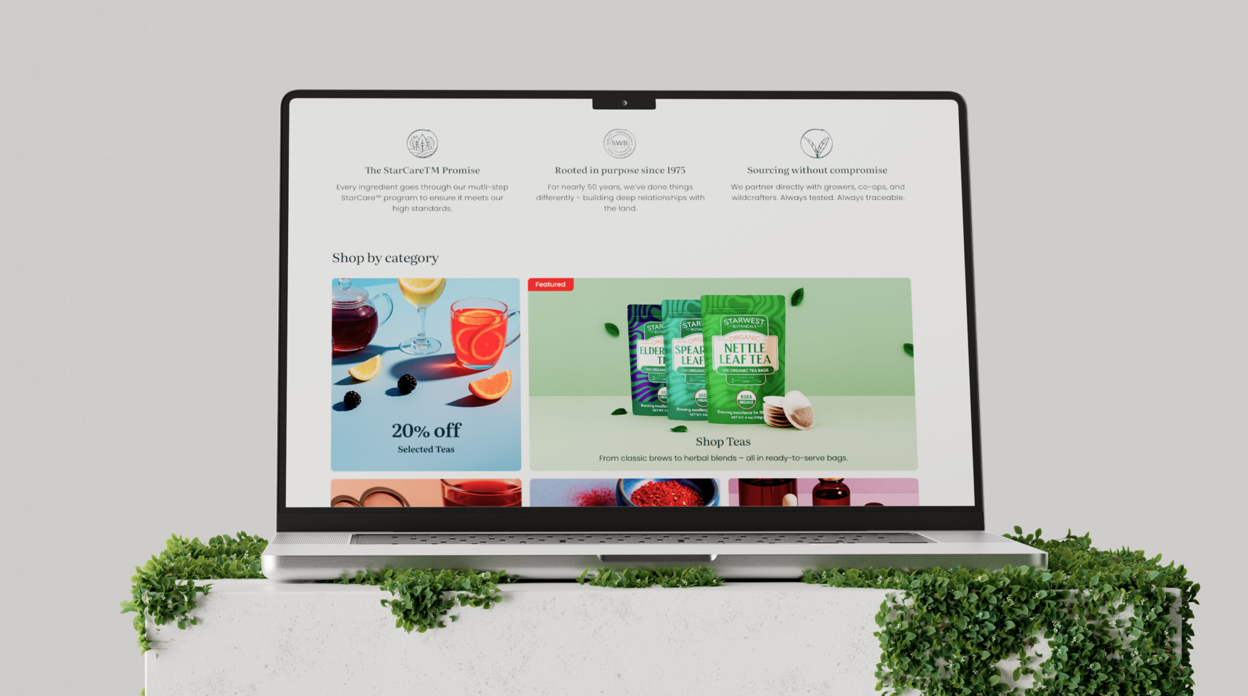
Solution
We partnered with Starwest Botanicals to redesign the ecommerce experience around customer behaviour.
Rather than starting with visual design, we focused on understanding how customers were interacting with the website, where friction existed and which journeys had the greatest impact on performance.
This included rethinking the homepage experience, improving site navigation, restructuring collection and category pages, and redesigning product detail pages to make information easier to understand and products easier to discover.
Every decision was made with one objective: helping customers find what they need faster and move forward with greater confidence.
The result was a more intuitive ecommerce experience designed to better serve both new and returning customers while supporting the continued growth of the business.

Results
The redesigned experience delivered measurable improvements across key ecommerce metrics.
Following launch:
- 54% increase in conversion rate
- 25% increase in product engagement
- 38% increase in add-to-cart activity
- 21% increase in completed sales
Demonstrating the impact of simplifying customer journeys, improving product discovery and reducing friction throughout the purchasing experience.

Experts in utilising cutting edge technology
